NAVCOV.COM
An online mental health tool to help you navigate the COVID pandemic.
THE ASK:
As the result of a hack-a-thon, a team of 15 volunteers gathered to identify and solve public health challenges as a result of the COVID-19 pandemic.
How to specifically identify the needs caused by this change?
Which needs can be addressed using an online tool?
THE SOLUTION:
Using the peer-to-peer support model, NAVCOV.COM leverages user experience design and public health best practices to help users acknowledge and address their mental health during this global pandemic.
THE UX TEAM:
Justin Bascos
UI/UX Design
Teresa Phan
UI / UX Design
Josh Quach
UX Research & Product Design
Steven Diaz
UX Research & Product Design
THE PRODUCT:
THE PROCESS:
In an all-hands workshop, we identified high impact, low cost tools in which our solution could help users address their mental health challenges. Through multiple rounds of research interviews, we developed a strong through-line for users coping with change as a result of the pandemic.
USER RESEARCH
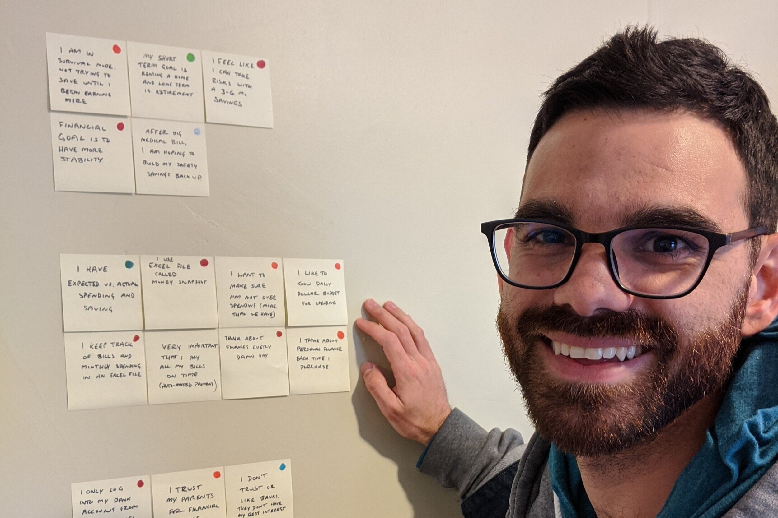
The UX Team conducted ten interviews with individuals of varying age, gender, and race and ethnicity across the United States to understand how people’s relationships, behaviors, and perspectives have shifted due to COVID-19.
USER NEEDS
We identified 4 major areas of focus:
Navigating trustworthy information online
Managing anxiety about the future
Struggling to deal with current changes
Desire to help others in need
We set out to design an online experience that was both safe and sincere, where users could investigate their feelings and discover resources along the way.
INFORMATION ARCHITECTURE
By working in tandem with the Content Team, the UX Team created a comprehensive site map as a reference tool to more efficiently create wireframes and prototypes for usability testing. Later on, the site map was instrumental when handing off designs to the developers for implementation.
Lo-Fi Wireframes and User Journey
Leveraging insight from our user personas, we designed lo-fi wireframe concepts. Our focus was to avoid information fatigue and create a concrete path for users to explore. Users will identify and acknowledge their own needs while feeling a sense of belonging for common struggles during a time of isolation and distance.
High Fidelity Wireframes
Products don’t exist in a vacuum - So in order to collect honest feedback on our wireframes, we built a fully functional wireframe to use during usability tests. This allowed users to explore the site uninhibited and enlighten us as to where further changes needed to be made.
Cohesive Design
As a volunteer remote team with many moving parts, our team collaborated on identifying important UI features based on our solution statement (safe and sincere guiding space for users). We produced a soft, yet diverse color scheme and trustworthy typeface along with large buttons centered around inclusion and acceptance.
FINAL PROTOTYPE
navcov.com is a clean and comfortable space for users to explore their mental health relating to changes caused by COVID-19. Using simple questions to guide users toward the most relevant and effective information specific to their needs. We have been able to leverage the peer-to-peer support model through extensive user research combined with a comprehensive database of resources to help remind us that we are all in this together.
Less is more - In order for users to feel heard, we needed to build something that would meet users where ever they are. Our competitive analysis proved that general, yet overwhelming amounts of data drove more negative experiences as emotions heightened.
Visual fatigue is real - Our site needed to reduce friction as much as possible to avoid mental and emotional fatigue. Color scheme, button size, and site copy were vital to the success of the tool.
Project Scope - While it was all too often tempting to ideate additional solutions, we needed to focus as a team to create a tool that would be beneficial to the most people in the least amount of time. We jokingly called each other to focus using the phrase “Is that MVP?”
INSIGHTS
The Navigating COVID team was made up of incredible individuals who volunteered their time, resources, and energy to create a product that could help and empower others during this difficult time. It was a joy to collaborate every Tuesday evening after our day jobs.
This is an important takeaway for me in regards to a company's “mission” and “culture”. When employees have a purpose to face challenges as a team, they often enjoy themselves more and work is of higher quality.


